July Mid Month - UI and Iteration
So when I published the last update I wanted to add a desktop version. When I built it and and tested it, I had no menus as well as no way to exit the game unless you force quit it. So that is what I have been working on this month. Started to work on basic game menu so players and exit the game.
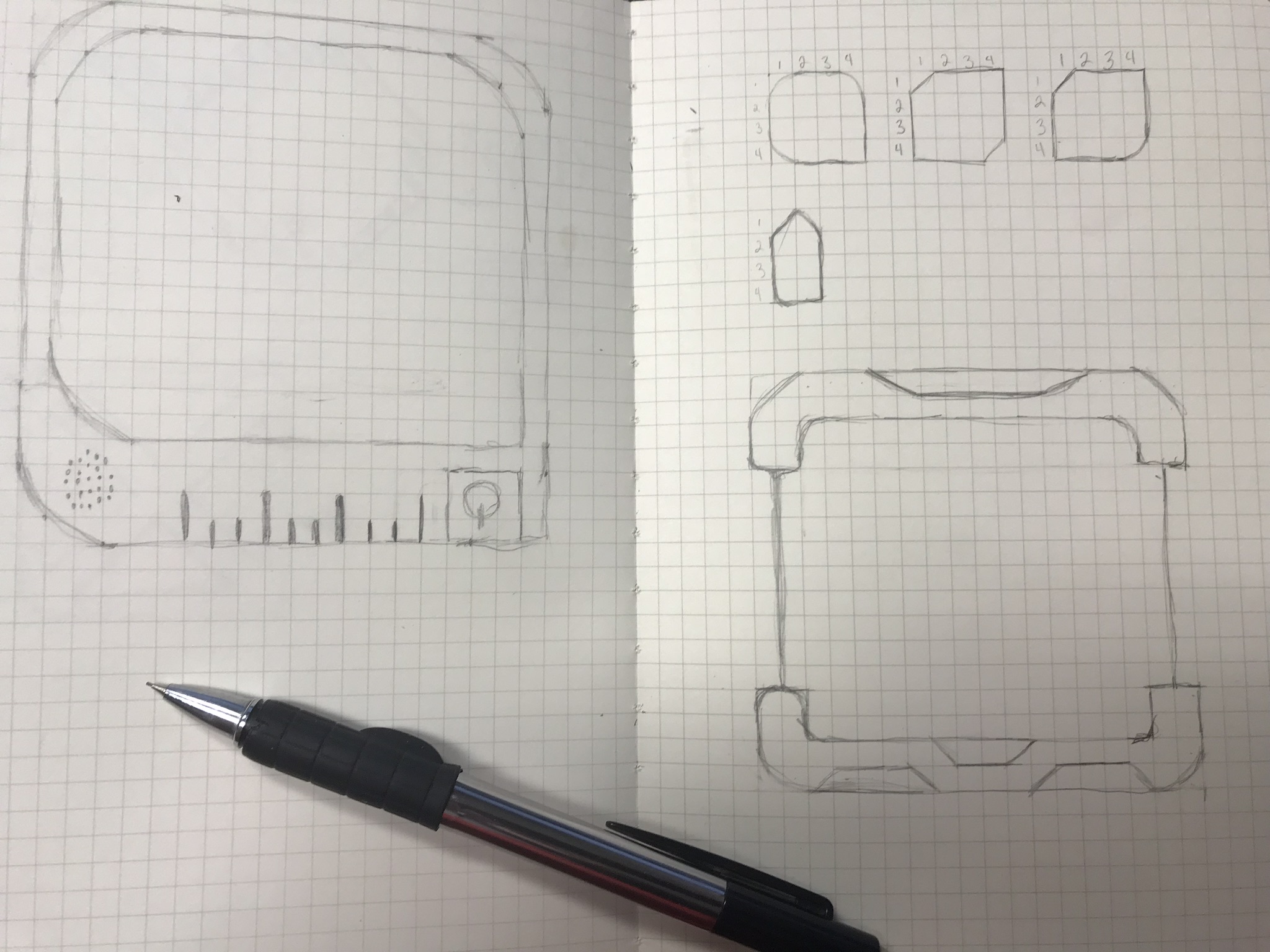
So I started with some sketches, I was bouncing between retro Sci-Fi and future Sci-Fi and went with the later
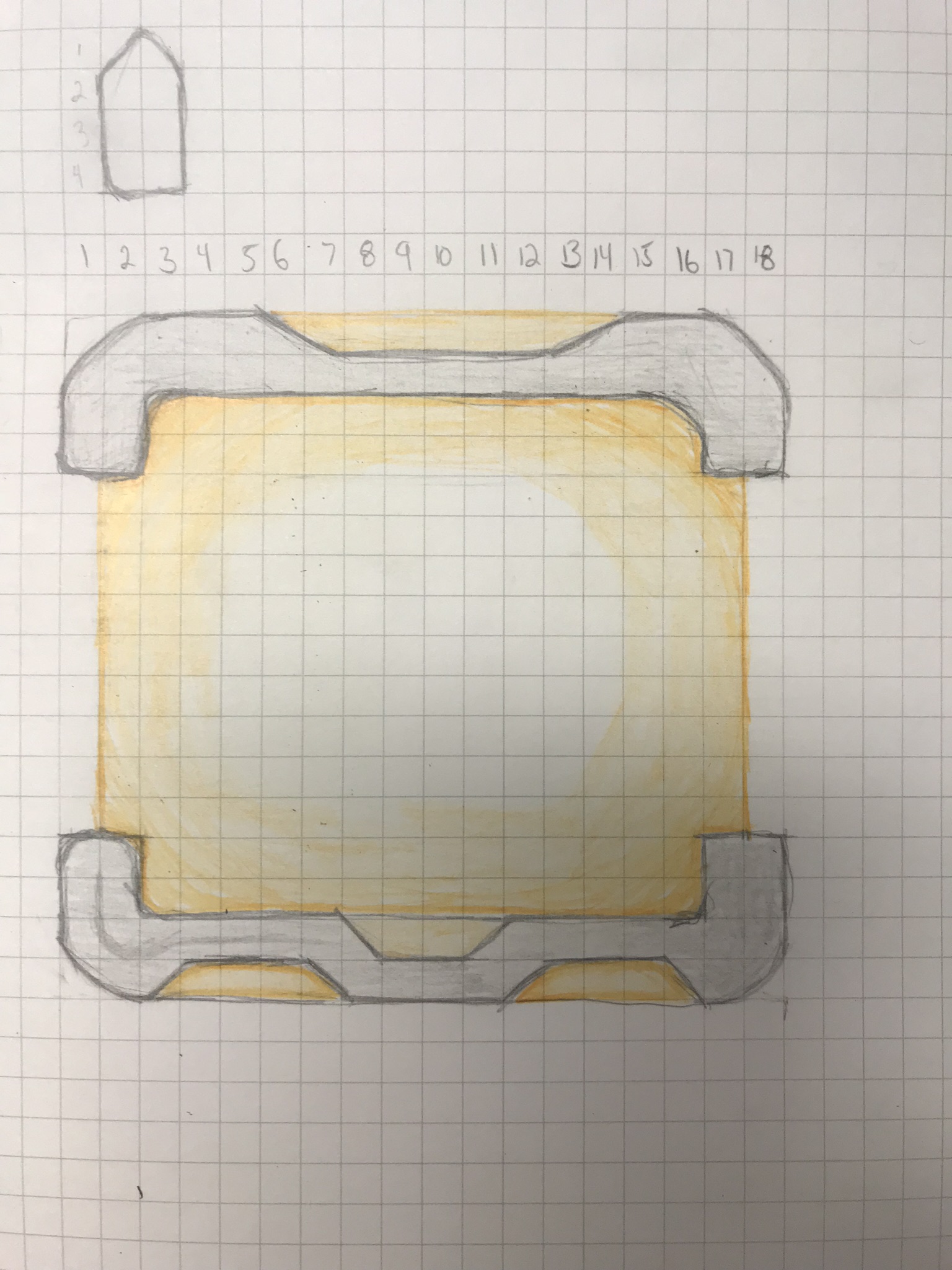
Then I did some coloring, kept it simple with colored pencils
Then I took the sketch and did it in illustrator
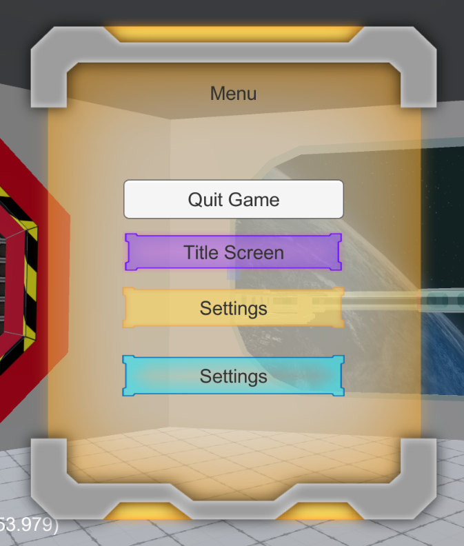
I have to saw for my 1st real go with illustrator I am happy with how this turned out.
After getting the background/panel to a happy place I started to work on the buttons. which was the same approach
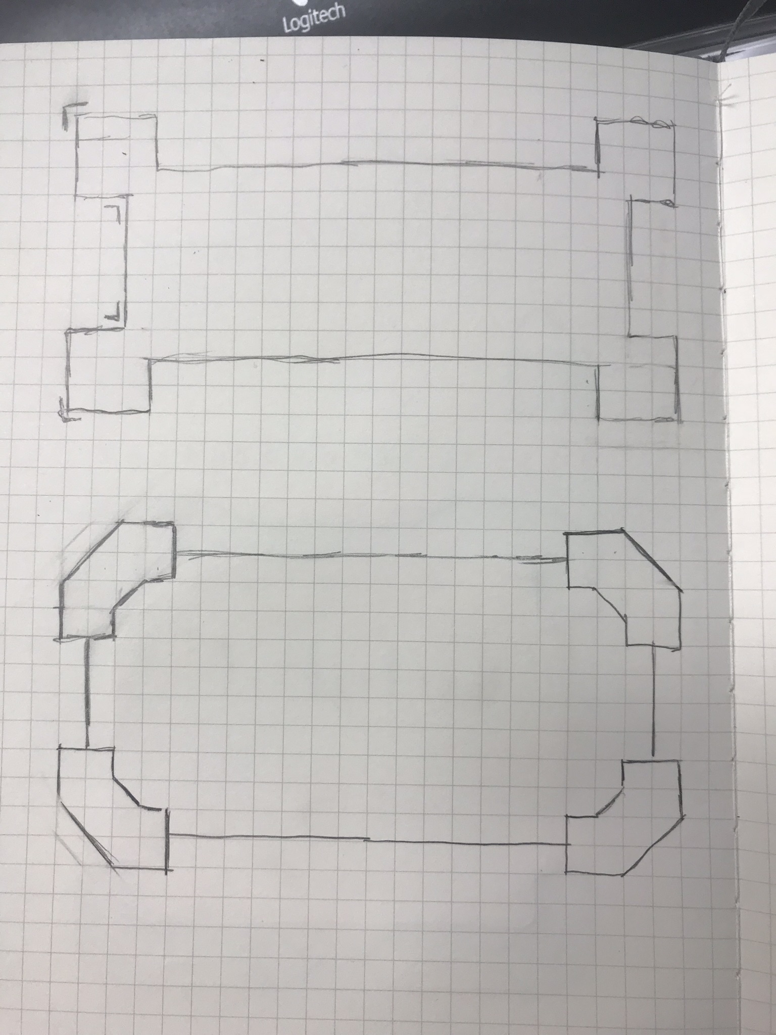
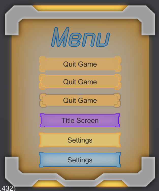
So then I had came up with 3 different variants of the Quit Game button, at the end of the day I went with button 3
Next Stop was messing around with text, Downloaded and Installed Text Mesh Pro
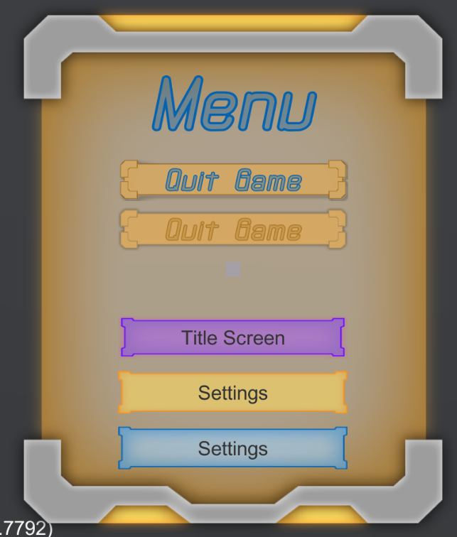
I started to look for some fonts as well mess with the colors and such, I think the blue over the orange looks the best. the 2 quit buttons are still 2 different images I feel like 2 is the better of the 2, thoughts?
Get Escape!
Escape!
Try and find your way out of the broken space station
More posts
- End of Month July UpdateAug 01, 2018
- End of Month June UpdateJun 30, 2018
Leave a comment
Log in with itch.io to leave a comment.